Technology Note 220
Theory Curve
The Theoretical Binding Curve, “Theory Curve”, is an interactive tool created and maintained by Sapidyne Instruments Inc. The Theory Curve is based on the reversible binding equation (eq. 1), describing the binding between two molecules in solution. As such, the theory curve illustrates the binding in solution independent of any particular measurement method. In this technical note we describe the use of the theory curve to help develop an intuitive understanding of reversible binding.
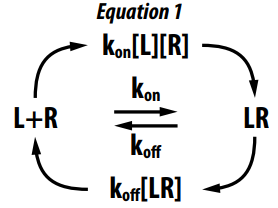
The graph of the binding curve shows the free fraction (percent free) of one of the molecules as a function of either the second molecule’s concentration or time, depending on the theory selected. This graph is interactive so you can change the conditions, by sliding a control, and see the effect it has on the graph. Interacting helps develop an intuitive understanding of binding that looking at the reversible binding equation (eq. 1) or the solution (eq. 2) to this equation, does not.

Note on CBP and Titrant: Constant Binding partner (CBP) and titrant are used as the names of the two binding partners instead of more conventional names such as receptor and ligand. This was done because the Y axis is always the percent free of the CBP, which may be a receptor, ligand, antibody, or another molecule.
A Guided Tour – Part 1, Equilibrium Curve
The default view upon opening the Theory Curve is an equilibrium curve. This curve shows the percentage of a CBP that is free at equilibrium (Y axis) as a function of the total titrant concentration (X axis). The CBP is constant in the sense that a given curve represents the free fraction of a single total concentration of this molecule, calculated for various concentrations of the titrant.
The binding modeled is reversible and individual molecules will be constantly associating and dissociating. Once equilibrium is achieved the rates of association and dissociation are equal and the percentage that is free remains constant. The percentage is determined by the Kd and the concentrations of the two molecules.
In Figure 1, the CBP concentration default value of 1 pM is shown in the CBP box under Curve 1 in the left panel. The CBP is also indicated by the intersection of the vertical red line with the X axis. Similarly the default Kd of 50 pM is shown under All Curves in the left panel and by the intersection of the black vertical line with the X axis. The ratio, equal to the CBP divided by the Kd, is also shown in the left panel with a default value of 0.02.
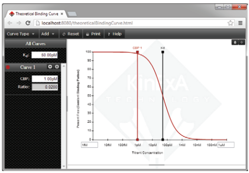
Figure 1. The default view of the Theory Curve.
Kd Controlled Curve:
This default curve is what we call a “Kd Curve” by which we mean the shape and position are strongly influenced by the Kd of the interaction. To see this, let’s add some theoretical data to the curve to act as a placeholder. Choose the Add drop down, then select Theoretical Data and press OK (generating data automatically is okay for this example). After adding the theoretical data, click on the black Kd line and drag it along the axis. The placeholder data we added stays where it was, but the theory line moves to a new position depending on the Kd value. You can observe the Kd value in the left panel updating as you drag the black Kd line along the X axis. You will also notice that the theory line does not closely match the placeholder data unless the Kd value is near 50 pM, the value used to generate the data. You can also drag the red CBP line. Notice that while the Kd value is near 50 pM, the theoretical line does not move appreciably for CBP values below about 10 pM. This curve is Kd controlled precisely because any movement of the Kd value shifts the curve, while movement of the CBP to any value below about 10 pM (or a ratio of 0.2) does not move the curve appreciably. These are general features of any low ratio curve. If you repeat the exercise and change the Kd to 50 nM, you see a similar insensitivity to the CBP concentration up to a value of about 10 nM (ratio of 0.2).
Concentration Controlled Curve:
Click Reset to erase the placeholders and set the Kd and CBP back to their default values. Change the CBP value to 5 nM (the easiest way to make this precise is to click on the CBP box, type in 5 nM and press enter). Notice the ratio updates to 100 and the theoretical curve moves to the right as shown in Figure 2.
Repeat the exercise of adding placeholder data and dragging the Kd and CBP values. Notice the sensitivity is reversed and this curve is quite sensitive to the CBP concentration while relatively insensitive to the Kd for Kd values below about 100 pM.
The implication of the sensitivities demonstrated is that if we have good quality data with a low ratio we can expect to get an accurate Kd measurement, but not an accurate measurement of the CBP concentration. Conversely with a high ratio we can expect to get an accurate measure of the CBP concentration, but not the Kd.
Please also investigate intermediate ratios, and notice the curve is somewhat sensitive to both the Kd and the CBP concentration. Press the Reset button when finished working.
Figure 2. A high ratio or Concentration controlled curve.
Multiple Curves:
The binding curve is at a single, fixed, concentration of CBP, but sometimes it is useful to see curves at more than one CBP concentration at the same time. Additional curves can be added to the graph. To do this just click the Add drop down and select Theoretical Curve. The new curve will be added along with its own CBP slider. Along the left column is a display for each curve showing its CBP concentration and ratio.
Set the Kd to 100 fM, the CBP for Curve 1 to 1 nM, and the CBP for Curve 2 to 10 nM. Notice that the spacing between these curves is the same as the difference in CBP concentrations. This is because they are both concentration controlled (very high ratio) curves (Figure 3).
Click the small padlock icon in the upper right hand corner of the theory curve. This locks the two CBP values together so when you drag either CBP concentration slider the other CBP slider follows. After clicking the padlock, drag the 1 nM slider to the left and notice how the lower 1 nM curve shape begins to change around 10 pM. You can also see the curves getting progressively closer together as they approach the Kd. This is especially evident when the curves are dragged past the Kd.*
*The ability to use the spacing between the curves as an additional parameter allows one to make highly accurate and precise analyses. This technique is a powerful tool in Kd measurements.
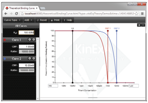
Figure 3. Showing two curves with different CBP concentrations on a single graph.
A Guided Tour – Part 2, Kinetics Time Course
The Theory Curve can also be used to look at kinetics. Go to the Theory Curve and first select Reset to get back to the starting conditions. Click on the Curve Type drop down and then select Kinetic Time Course. The dashed line is the equilibrium point, and the curve represents how the CBP free fraction changes with time in its approach to equilibrium (Figure 4). By convention time 0 is when the CBP and titrant are first mixed, so it is 100% free at time 0. Since we are now looking at what happens over time, the X axis is time instead of concentration. For this reason it is not possible to indicate the Kd and CBP values on the graph (both have units of molar) so they appear on sliders beneath the graph.
Also, because more information is needed to calculate the curve, some new sliders have been added: kon, koff, and Titrant concentration. The two kinetic parameters, kon and koff, are tied together through the Kd, so moving one of these will move the other to keep the Kd at its fixed value. Changing the Kd will only change the koff value, so that kon is kept at its fixed value.
We can use this curve to help understand the limits of using concentration to control reaction speed. With the default parameters, which specify a CBP well below the Kd (ratio = 0.02) and the Titrant equal to the Kd, the reaction comes to equilibrium at 50% free in about 5000 seconds. Click in the Titrant box in the left column, and type 1 nM then press Enter. By increasing the titrant concentration the reaction speeds up, and now reaches equilibrium in about 500 seconds. Change the Titrant concentration 10 fold higher to 10 nM, and the reaction will go 10 fold faster, although the X axis scale will be too wide to see this directly. The scale can be changed by typing into the box just under the right end of the X axis. Type 100 into this box and press Enter. Now you can see the reaction went 10 fold faster, and reaches equilibrium in about 50 seconds. At 100 nM it will take about 5 seconds. You can make the reaction as fast as you like by increasing the titrant concentration.
There is a limit, however, to slowing the reaction by lowering the concentration. Press Reset to return to the default settings, then grab the Titrant slider and move it from just over the Kd, to well below the Kd. As you are moving the slider notice that the equilibrium point (the dashed line) changes, but the reaction cannot become slower than about 5000 seconds to equilibrium.
Figure 4. Kinetics Time Course default view.
A Guided Tour – Part 3, Kinetics Pre-equilibrium
Select Reset again to be sure you are at the starting conditions. Select the Curve Type drop down and choose Kinetics Pre-Equilibrium. The X axis is once again concentration so the CBP and Kd sliders are again located on the graph (Figure 5). Drag the Time slider back and forth to see how the binding curve approaches the equilibrium curve, indicated by the dashed line. As you observe it approaching equilibrium the last part of the curve to reach equilibrium is on the steep part of the curve. If an equilibrium experiment is attempted and the samples were not yet at equilibrium, it will show up mostly in the repeats of the samples in the middle of the curve as they will undergo the greatest change with the difference in time. See Technology Note 205 Drift Correction Analysis (TN205) to learn more about drift versus samples measured before equilibrium.

Figure 5. Kinetics Pre-Equilibrium default view.
Relationship Between the Different Curve Types
All of the curve types are derived from the same fundamental equation (eq. 1). This can be seen in Figure 6, a 3D plot, showing how these curves are related. Each curve looks at a slice of the same 3D surface: kinetics time course slices at a point in titrant concentration (yellow line), kinetics pre-equilibrium slices at a point in time (orange line), and the equilibrium curve is at infinite time.
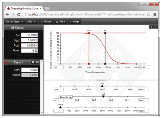
Figure 5. Kinetics Pre-Equilibrium default view.
Relationship Between the Different Curve Types
All of the curve types are derived from the same fundamental equation (eq. 1). This can be seen in Figure 6, a 3D plot, showing how these curves are related. Each curve looks at a slice of the same 3D surface: kinetics time course slices at a point in titrant concentration (yellow line), kinetics pre-equilibrium slices at a point in time (orange line), and the equilibrium curve is at infinite time.
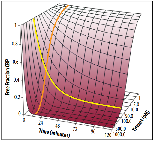
Figure 6. The free fraction of the CBP plotted versus time and titrant concentration. The yellow line corresponds to the “Kinetic Time Course” curve type while the orange line corresponds to the “Kinetic Pre-equilibrium” curve type.
Using the Theory Curve to Help With KinExA Experimental Design
Although the Theory Curve is based on the fundamental equations of reversible binding describing the state of samples, it is still directly applicable to KinExA experiments. The reason for this is because KinExA measurements can accurately determine the free CBP in a mixture without perturbing the sample. The Equilibrium Curve represents a Standard Affinity experiment, the Kinetics Time Course represents a Kinetics Direct experiment, and the Kinetics Pre-Equilibrium represents the Kinetics Injection experiment.